Carbon Crossroads is an immersive, single-page web application that transforms complex global CO2 emissions data into a compelling visual narrative. By combining high-fidelity charts with storytelling elements, it breaks down decades of climate data into digestible insights, covering global trends, fuel sources, and geopolitical shifts without overwhelming the user.
“The objective was to move beyond static spreadsheets and create a 'scrollytelling' experience where data comes alive. I focused on performance and interactivity, ensuring that complex datasets render beautifully and instantly as the user explores the narrative.”
The application operates entirely client-side, utilizing advanced JavaScript to process raw data arrays into dynamic visualizations in real-time. It features a responsive design that adapts complex charts for mobile viewing while maintaining a cinematic feel through parallax effects.
Built with a focus on visual impact and performance, the architecture decouples data processing from rendering. The application uses a "lazy-loading" strategy for visualizations, ensuring the browser's main thread remains unblocked during initial load, resulting in a smooth, 60fps scrolling experience.
IntersectionObserver before their animation can be triggeredThe project leverages the power of the Canvas API via Chart.js for rendering, while Tailwind CSS handles the responsive layout and typography.
Used for rendering HTML5 Canvas visualizations. Configured with custom animations, tooltips, and responsive scaling to handle diverse data types (Line, Bar, Scatter).
Utility-first CSS framework used to rapidly build the parallax grid layout, typography system, and responsive containers without writing custom CSS files.
Native browser API utilized to detect scroll position, triggering chart rendering functions only when specific sections become visible to the user.
Core logic handles data simulation, array filtering/reducing for specific metrics (e.g., "Top 10 Emitters"), and DOM manipulation without heavy frameworks.
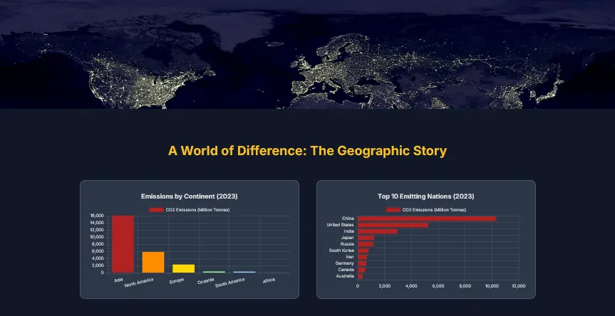
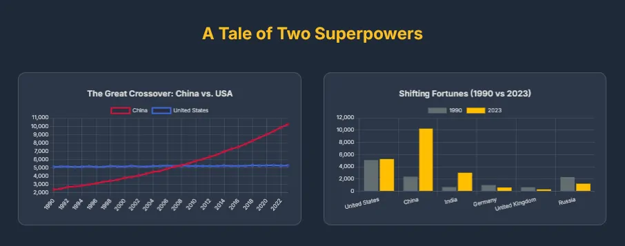
Visualizing three decades of data for multiple countries presented specific challenges regarding browser performance and data accuracy.
Building a data-heavy application requires balancing visual fidelity with execution speed. Managing the "paint" cycle of the browser was critical to prevent scroll-jank when rendering complex canvas elements.
IntersectionObserver API to watch chart containers. A chart's rendering logic is encapsulated in a closure and only executes the moment the user scrolls it into view, distributing the computational load over time.
reduce, filter, and map methods to dynamically aggregate the flat data into chart-ready datasets on the fly. For example, the "Fuel Source" area chart dynamically calculates the sum of coal, oil, and gas for every year in the dataset before rendering.
maintainAspectRatio configuration combined with Tailwind's grid system. I wrapped every canvas in a responsive div container to control height, ensuring charts are legible on phones while expanding to fill the screen on desktops.
Carbon Crossroads demonstrates how modern web technologies can turn dry statistics into an engaging narrative. By mastering the intersection of DOM manipulation, data processing, and visual rendering, this project serves as a robust example of full-stack frontend capability.